Monday 10 May 2010

Retouching Eyes in Photoshop

I think the key to a fantastic portrait lies with the eyes. They really need to capture the viewer and draw them into the picture in my opinion, and a little bit of Photoshop can go along way to making eyes pop. Here is a small tutorial to describe my way of doing it.
  • Use a soft edged brush for this.
  • Start with the Dodge tool set on highlights (around 15% opacity) to lighten the whites of the eyes (usually after any other retouching to skin etc) and the catch light in them if there is one.
  • Use the Burn tool set to midtones (around 15%) to darken the pupil.
  • Go back to the Dodge tool and set it to midtones (15%) and lighten the iris.
  • Finally, use the Burn tool again (15%) set to midtones to darken around the outside of the eye. The brush size should be quite small, and try to keep just inside the eye so as not to make the whites outside darker.
And there you have it, eyes that pop. Here is an example of before and after of my mum's eyes.

Friday 7 May 2010

Model's Needs from a Photoshoot

As a photographer I know which shots looks good and I know exactly what I want in a shot for my portfolio. Friends and family get roped in to my shoots, but are not that bothered about getting a print themselves. However, I asked people I have used in my shots what is important to them in a portrait. I asked the question on Facebook, so I could get a range of people's opinions quickly.

The question I asked was "Friends and family alike, please answer this!! What are the most important things you look for in a good, professional portrait of yourself?" and I got 9 responses.

A fellow photographer said she looked for good editing, models I've used in the past said good colour, making sure the model has good skin even if she/he doesn't, and someone else said a flattering pose. A friend's mum wanted a portrait that made her look younger and slimmer, yet someone else said that confidence and a connection between the model and photographer was important to them.

This is very interesting because when I take a picture my highest priority is good lighting, professional equipment to take the picture and making the model feel comfortable. I do understand retouching is needed to be done after, but I did not realise it was so important to the model. This is key information that I will bare in mind when retouching pictures in the future.

Gritty Portrait Tutorial

I decided to take a book out of the library,"The Adobe Photoshop Lightroom 2 Book for Digital Photographers" to get some ideas for portrait effects. The online tutorial is shown on Scott Kelby's blog.

I came across a tutorial which makes the portrait look very dark and moody, with all the highlights and details extremely defined. It was very helpful using this tutorial, as I do not usually use Lightroom for retouching; I tend to use layers in Photoshop. It very easy to do and I would definitely use the technique again. I changed my picture to black and white though because I think the effect for this picture just works so much better than if it had been left in colour.

The effect he used produced this picture:


I decided to try this on a photograph I'd taken of Andy, outside the church in Hartlepool.
The original is shown on the left, the gritty effect applied on the right. I think this effect looks really really good, though I do understand that it will only work on certain portraits. I shall be using the image on the right as one of my final prints.


Thursday 6 May 2010

Desaturation Example

After seeing the picture from The Photo Forum, I decided to try desaturated colour myself.
I opened my chosen picture, got rid of any blemishes using the clone stamp / healing tool, softened skin using surface blur (tutorial on this later), and corrected the white balance. Seeing as multiple layers were used, I flattened the image before doing anything else.

I upped the brightness and contrast to start with seeing as my picture was rather dark. I then clicked:

Image > Adjustments > Hue and Saturation

Moving the Saturation slider all the way to the right makes the colours very very vibrant. If a bright colourful picture is what you want, move the slider to around +25.
However, I wanted desaturated colour so I moved the slider to the left. All the way left makes the picture go black and white, so I stopped around the -75 mark to give just a hint of colour. I then used the brightness and contrast tool again and got the final image.
Below is the original image, a desaturated image and a pure black and white image.

Desaturation

In earlier posts I have said that because I already have a lot of black and white portraits under my belt, I wanted coloured prints. Split toning is a good way to add colour to a black and white image, as I have shown using the picture of Lucy. Another way of adding slight colour is to keep the photograph colour, but move the "Saturation" slider down in Photoshop. Not all the way down as this would make it black and white, but slightly down so the colours are rather muted. This is an example taken from The Photo Forum. Someone wanted to know what a specific camera could do, and the girl who took this explained that only a bit of slight desaturation and a cool white balance was used. I want to try this in a few of my pictures to see what effect it gives.

Sunday 2 May 2010

Textures

After looking at Lara Jade's work, I have noticed that she uses a lot of stock textures overlaid over the picture to give it more depth. These include light spots, scratches and paint splodges. It is a hard thing to incorporate in to imagery but it makes the end print really exceptional. They can be used both in colour and monochrome, though care is needed when using blending modes as the colours can sometimes clash with the original picture.
Digital Photography School offers a very detailed and precise tutorial on how to use textures over a picture, though it does say techniques and blending modes depend on both the picture and the texture you are using. I used the tutorial and the end effects produced this:


I think using textures suits some pictures but not others, and I do not think it helps this picture in the slightest. However, this tutorial is something to keep in mind for the future, if I ever want to try textures again.

Split Toning

I used the step by step guide on split toning from Tutorial Pulse to create the picture below. This was a very natural pose by my friend Lucy against the brick wall of her house. I changed it to monochrome and added purple highlights with blue shadows. I think this works really well as it gives the black and white portrait colour, without being too contrasty. I might not use this technique for all the pictures for this project, but I will certainly experiment with different colours on different pictures.

Monday 8 March 2010

Guide: Making A Digital Polaroid

I decided to give the Men's fashion print a bit of a funky look, so I made the pictures into digitally created Polaroid pictures, totally using information I'd collected myself. This is a guide to creating them, my way!
  • Open the image you want in the Polaroid frame.
  • Get rid of any blemishes, scratches using the clone or spot-healing tool.
  • Make any contrast / saturation changes if you want to make the picture look like a Polaroid
  • When done, use the Selection tool and while holding the Shift key, drag a square around the part of the picture you want in the Polaroid.
  • Go to Selection > Modify > Feather, Radius 5
  • Go to Edit > Copy
  • Click File > New > Size 8.8 x 10.8cm
  • Click Edit > Paste
  • Move the new layer so the border around the top and 2 sides are equal, with a bigger space underneath.
That's pretty much it, unless you have a white background in your picture, in which case go to the Blending Options on that layer and add a small line around it using the Stroke tool.

Here is one I just did, using this method:

Guide: Layers

This walk-through demonstrates how I achieved the different layers to get the shoe print.

• Open image
• Get rid of any blemishes / scratches using the clone or spot-healing tool

For this particular print I decided to use a white background to put all the layers into, but decided to use a peach background around the different segments of shoe, so they would stand out. I set the background colour to peach using the dropper tool, and then erased the shadows and highlights around the shoe, so the background showed through.

• Use the Selection tool to select the parts of the image you like.
• Click Edit > Copy
• Click File > New and set the dimensions to 29.7cm x 42 (A3) with a white background
• Click Edit > Paste, then move the new layer to where you want it. If you need to move it again, either press the small arrow icon at the top of the tools pallet or press CTRL and T (or Command and T if on a Mac)
• Do this with all the different pictures you want to layer into the print
• If you want to move 2 or more layers together, use the little lock symbol next to the layers in the pallet. This chains them together and moves them simultaneously.

If you wish to add a shadow to the layers to make them stand out from the background, simply double click on the layer to open the Blending Options, and check the box Drop Shadow. Click on the title, and you can make changes to the size, spread, angle etc.

Pasting different layers into an image is very easy, the hardest part is getting the right parts in the right place. After much work though, it does look effective.

Guide: Selective Colouring

This is a step-by-step guide on how to get different tonal effects in the pictures you take, using Photoshop’s Selective Colour tool. I used this particular tool in the Polaroid shots of Andy. It is good for adding colour to black and white pictures, but is also good to give colourful pictures a slightly different mood.

• Open your image
• Get rid of any imperfections using the clone or spot-healing tool.
• Click Image > Adjustments > Selective Colour
• Where it says “Colours”, click the drop down arrow and you will get a list of different colours. Whichever color you wish to change in your picture can be selected from this drop down selection.

If you have trouble deciding on what look you’re wanting, just try moving the sliders on different colours and experimenting first. It helps writing down what you did though, so you can achieve the same look again without too much trouble.

I chose this picture to demonstrate the different kinds of effects you can achieve.

Original:

Desaturated then set to Whites > Cyan -33 > Neutrals > Cyan +8, Yellow +9 to achieve this:


Kept the colour, but used Selective colour to pick out the blues and cyans, then made the black parts really dark to achieve this:


Again, kept the colour, but increased the Whites to make them more yellow, then added magenta to the neutrals to get this:


Mostly, Selective Colour is trial and error, but the above examples give you an idea of what kind of effects you can achieve with the tool.

Thursday 4 February 2010

Studio Session: Screens

So this week I learnt that the studio has been booked out for us to use every time we have a lesson, so me and my friend Andy decided to get our things together and organise a shoot for today (we had professional studies yesterday, so today was our best chance.)

I wanted to do some tests of cakes, so I know how to set up the lights for when I do the more expensive foods, like oysters. Andy brought in some toys he wanted to do tests of, but when we got into college, we found we actually had a lesson! Best laid plans and all that...

Anyway, today we went into the studio and found a set all ready set up; a green paper roll against a wall provided a colourful backdrop, 2 lights on tripods and the Hasselblad and Mac set up in front. He explained that using a big soft box gives you no freedom, light wise. The light cannot be moved away from the diffuser, nor does it cover the whole diffuser in even light. By attaching a screen to a tripod, lights can be put behind it, moved backwards, forwards, can be tilted etc, etc. There is so much more freedom. So, the lesson started with us all putting one up (very successful, no problems at all.)

We then ended up taking portraits of each other. A stool was set down in front of a paper roll stand. A white box with a black piece of fabric over it was placed in front of the stool, so the models had something to lean on. The boom was set up with a dish on it, and was set shining down on to the model from above, through a screen set on 2 tripods, one each side of the stool. A pink piece of fabric was thrown over the paper stand (later on the green paper roll made a re-appearance) and Andy sat in front of it so we could take his picture.

Here is the lighting diagram:


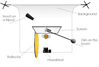
We did end up putting in a hair light behind the model (the snoot) and we started with a light behind the pink fabric we draped over, but took it out when we used the paper. We took the strip light off its stand a laid it on the floor, tilted up at the background so the light hitting it would be graduated.

I wish I had an example to show, but I didn't actually take any pictures, so it would be wrong of me to include them. However, I am learning that using one or two lights are usually enough to experiment with; I've learnt that screens are awesome to use instead of light boxes, as the light onto it can be controlled far easier, and I've learnt that colourful paper rolls on stands are soooooo much better than plain white or plain black backgrounds. Would have liked to have known how easy it is to put them up earlier!

Almost forgot, we have decided to book out a small studio space on Tuesday morning for our food / toy shots. Very looking forward to it actually, I just need to buy more cakes :P

More research coming.

Tuesday 12 January 2010

Lecture: Photography & Shadows

Today's lecture was directed towards looking at shadows in photography. They can be used to create atmosphere if included in the shot, they add depth to the picture and make things 3D and if they are not included in the shot, there is usually a good reason why.
We had to go to the library and find some examples of shadow photography. After getting there last (and having a lengthy search) I finally found a couple of examples out of "The Photo Book".

The first picture I found was taken by Martine Franck in 1976, "Le Brusc, South Of France" The picture is below. This picture is a great example of a distinct shadow, but one that is separate to the subject. The photographer has cropped the image to make sure that the shadow underneath is not attached to anything at either side, making it almost look like a reflection rather than a shadow. This picture however has been taken on location and I did not find a picture like this that had been taken in a studio.


The other image I found was by Jaromir Funke, "Untitled" 1927, shown below.


This picture consists of only shadows, and no actual objects. This was probably done in a studio due to the amount of control in the lights and the position of the glass bottles, though I can not be sure. I love it in black and white as it adds to the mystery of the picture; as there are no actual objects in the picture; one wonders how shadows can be this alluring and interesting to look at.

Shadows are not something one would normally include in studio work; as you have a large white background you sometimes expect to keep it that way. This little bit of reseach shows that shadows can be a good thing and add things to a picture rather than taking focus away.